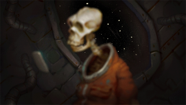
I took a screenshot recently of Sword in the Stone and painted on top of it to study some lighting. It's a great exercise, I think I'll probably do some more soon!
Very interesting exercise. I would love to see your process for something like this, it helps to see how others think through a concept like lighting from beginning to end.
I still think the original's better, but it's an interesting exercise nonetheless. Look at an artist like Norman Rockwell, and see how much pure shape he uses. Adding oddly rendered masses to sleeves and stones takes away from the pure communication expressed by the shape. Shape, appeal, and simplicity are everything! Everything else is, as a famous Cal Arts teacher put it, masturbation. I know simplicity/appeal are not what you're paid for, and it's certainly not a prevalent thought in the current video game concept arena, but if you'll take a look around your field I think you'll see everything's starting to look an awful lot alike, and pure, simple appeal is disappearing. Compare Disney Infinity (simple/appealing) to Skylanders (overly-complex/ugly).
@Anonymous - I couldn't agree more, I like the original much much more than my iteration.
I hope you understand that I'm not pitching anything here, I was simply taking a frame of animation and giving it an illustrative pass. I can't help but think your thoughts are slightly misplaced, as my goal was to actually bring a level of rendering and realistic lighting to the shot, not "improve" it, as you imply.
I'm a 3D+texture artist by trade, so I've definitely got a long way to go in this arena, and your advice is appreciated.
Personal preferences apply to everything in life, stick with your passion and those that "prefer" your style will support you. Thank-you for sharing your passion with us. Nice work!
this is awesome. is there any way I could get a print of this for adorning my living room wall? Also saw the 101 Dalmatians one on reddit. Would love to get prints of both, is this something we could work out?
I like yours better except for its cuts into Excalibur. I know this is being a stickler for detail, but Excalibur can't scratch, dent or break. It should be pristine.


16 comments:
I'm totally doing these on my lunch breaks
Very interesting exercise. I would love to see your process for something like this, it helps to see how others think through a concept like lighting from beginning to end.
I still think the original's better, but it's an interesting exercise nonetheless. Look at an artist like Norman Rockwell, and see how much pure shape he uses. Adding oddly rendered masses to sleeves and stones takes away from the pure communication expressed by the shape. Shape, appeal, and simplicity are everything! Everything else is, as a famous Cal Arts teacher put it, masturbation.
I know simplicity/appeal are not what you're paid for, and it's certainly not a prevalent thought in the current video game concept arena, but if you'll take a look around your field I think you'll see everything's starting to look an awful lot alike, and pure, simple appeal is disappearing.
Compare Disney Infinity (simple/appealing) to Skylanders (overly-complex/ugly).
@Anonymous - I couldn't agree more, I like the original much much more than my iteration.
I hope you understand that I'm not pitching anything here, I was simply taking a frame of animation and giving it an illustrative pass. I can't help but think your thoughts are slightly misplaced, as my goal was to actually bring a level of rendering and realistic lighting to the shot, not "improve" it, as you imply.
I'm a 3D+texture artist by trade, so I've definitely got a long way to go in this arena, and your advice is appreciated.
I like yours better than the original
Personal preferences apply to everything in life, stick with your passion and those that "prefer" your style will support you. Thank-you for sharing your passion with us. Nice work!
this is awesome. is there any way I could get a print of this for adorning my living room wall? Also saw the 101 Dalmatians one on reddit. Would love to get prints of both, is this something we could work out?
hey i love your work, quick question tho. are you using computer software to draw your drawings or are they by hand?
Nice work!
Wow amazing! Much more depth and atmosphere
Beautiful work!!
very ecited on your article,, good job,, i like it,,
Interesting!
I like yours better except for its cuts into Excalibur. I know this is being a stickler for detail, but Excalibur can't scratch, dent or break. It should be pristine.
This is so cool!!!
paket wisata bromo 2 hari 1 malam
Post a Comment